 Русский
 English
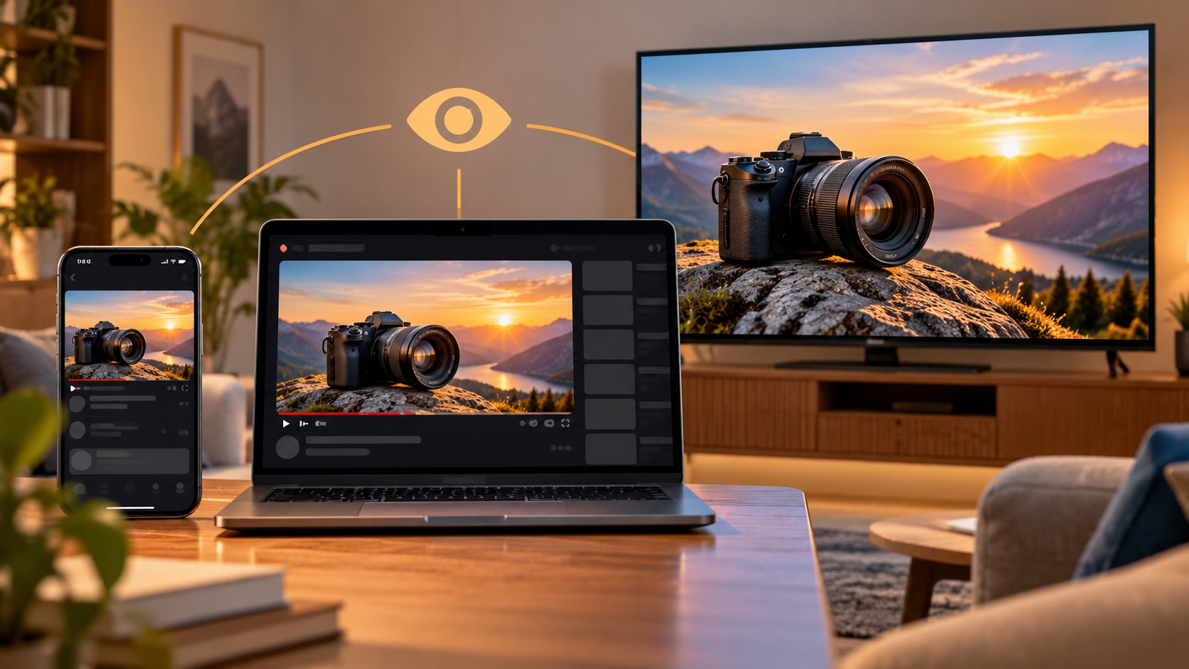
Check your YouTube thumbnail on mobile, desktop and TV
The same thumbnail can appear in a phone feed, beside a desktop player or across the room on a television. Its surroundings, display size and interface overlays change. A design that looks clear at full size in an editor can fail in any of those settings.
Check both meaning and image quality before uploading. Small-scale readability and high-resolution output solve different problems; you need both.
Where the thumbnail appears
There is no single reliable pixel size for every YouTube layout. Devices, browser width and app versions affect the presentation. Use these contexts as a checklist rather than a fixed specification.
| Viewing context | What changes | What to check |
|---|---|---|
| Mobile Home feed | The image may be relatively large, then give way to inline playback | A clear subject during scrolling |
| Mobile search | The thumbnail competes with results for a specific query | Recognizable relevance and readable wording |
| Desktop recommendations | The card can be much smaller than the main player | Small details, lettering and object recognition |
| Desktop Home grid | Several thumbnails share the screen; hover actions may appear | Hierarchy among neighboring cards and possible overlays |
| Television | A large screen is viewed from farther away | Contrast, thin lines and source-image quality |
| An embedded player | The surrounding website controls the available space | The image's clarity as a player cover |
Inline playback and preview behavior depend on settings and platform. Do not design on the assumption that the static thumbnail stays visible indefinitely.
TV: a larger screen is not permission for smaller text
A television may have a large physical image, but the viewer is usually farther away. Fine captions and delicate outlines can disappear at that distance. Meanwhile, poor cutout edges, strong compression artifacts and low-resolution source photos can become more noticeable.
Check the device mix in your own analytics instead of assuming all channels have the same viewing habits. Even a modest share of TV viewing can justify a quick distance check if the thumbnail contains fine details.
YouTube currently recommends 3840×2160 for ordinary video thumbnails and permits desktop uploads up to 50 MB. That recommendation provides a larger source image; it does not make an overcrowded layout readable. Simply enlarging a blurry small image does not recover missing detail.

Leave room for interface overlays
In common layouts, a duration badge occupies the lower-right corner. Previously watched videos may show a progress line near the bottom, and desktop hover actions can cover another part of the image. Rounded corners can remove small details at the very edge.
These are practical interface observations, not an official universal safe-zone template. Inspect the actual devices and app versions relevant to your audience. Keep a price, final word or essential product feature away from the lower-right corner and avoid placing important content flush with the edges.
A blank background area can safely sit beneath an overlay. A caption that loses its last word cannot. Design around the meaning of what might be covered, not just a decorative margin.
What disappears first in different niches
| Niche | Vulnerable detail | Possible simplification |
|---|---|---|
| Technology reviews | Ports, small labels and packaging text | A clear product angle and one meaningful detail |
| Gaming | Interface controls and distant characters | A larger subject or one decisive scene |
| Cooking | Many ingredients across a wide table | One dish, a cut surface or a visible texture |
| Education and analysis | Dense charts, tables and screenshots | A simplified relationship or one relevant number |
| Travel and vlogs | A tiny person in a visually busy landscape | A stronger silhouette or a recognizable location detail |
| Interviews | A distant two-person shot and small name labels | Clear faces and a short, accurate quotation |
These are options, not rules to apply blindly. A tiny person can communicate scale in a simple landscape. It fails when the viewer needs to recognize that person and cannot.
A practical five-minute readability check
- Reduce the image to a small card on your monitor. View it from your ordinary working distance rather than leaning forward.
- Place it in a private mockup of a relevant mobile search or feed layout. Include the intended title, because the pair carries the message.
- View it on a television from your usual seat, if available. Otherwise, step back from a monitor as an approximate check, without treating that as an exact TV simulation.
- Cover the lower-right area with a badge-sized rectangle based on the interface you are checking. Confirm that no essential word or detail disappears.
- Describe the image and expected video in one sentence. Ask another person to do the same without first explaining your idea.
This is a comprehension and visual-quality check, not a prediction of CTR. A reader may understand the image perfectly and still have no interest in the subject. Keep those questions separate.
Fix the largest communication problem first
If the wording is unreadable, shorten it before reducing the font further. Try a clearer or heavier typeface and improve separation from the background.
If the main object is unclear, crop closer or remove secondary items. If everything merges, increase the lightness difference between the subject and background rather than merely making every color more saturated.
If an overlay hides content, reposition the meaningful element. If the large-screen version looks rough, inspect the source photo, cutout and export compression separately. A readability fix will not repair an inaccurate generated detail or a visibly blurred product image.
Apply the same check to generated thumbnails
Bloggers.tools supplies a downloadable JPG; its horizontal output is 1920×1080. That is distinct from YouTube's current 3840×2160 recommendation. The service also offers a vertical 9:16 generation, and another orientation requires a separate generation.
You download the image and upload it yourself, so inspect it before publication. Check every letter, the likeness of people and the accuracy of objects. If a caption is too long, supply shorter custom wording. Refinement of an existing result depends on the selected plan.
For a custom Shorts thumbnail, current YouTube documentation describes desktop Studio upload and recommends a vertical file. A vertical design is not simply a horizontal layout squeezed into a taller canvas. Review the main subject and caption placement again.
Frequently asked questions
Can mobile show a different thumbnail from desktop?
Often the same custom image appears at a different size, but there are exceptions. YouTube says that vertical videos with 16:9 custom thumbnails can use automatically generated 4:5 thumbnails on mobile Home, Explore and subscriptions surfaces. Check the actual format and destination rather than assuming identical presentation everywhere.
What thumbnail resolution should I upload?
Current guidance recommends 3840×2160 for ordinary videos and 2160×3840 for Shorts. Desktop uploads allow up to 50 MB; mobile ordinary-video uploads have a 2 MB limit, with separate podcast limits.
Do I need a separate TV thumbnail?
Ordinary thumbnail upload does not provide a separate TV-only file. Check the shared design for both distance readability and image quality.
Can I put anything in the lower-right corner?
Background and nonessential detail can go there. Keep critical words, amounts and features away from the area where common layouts place the duration badge.
References: thumbnail specifications, inline playback and video previews.