 Русский
 English
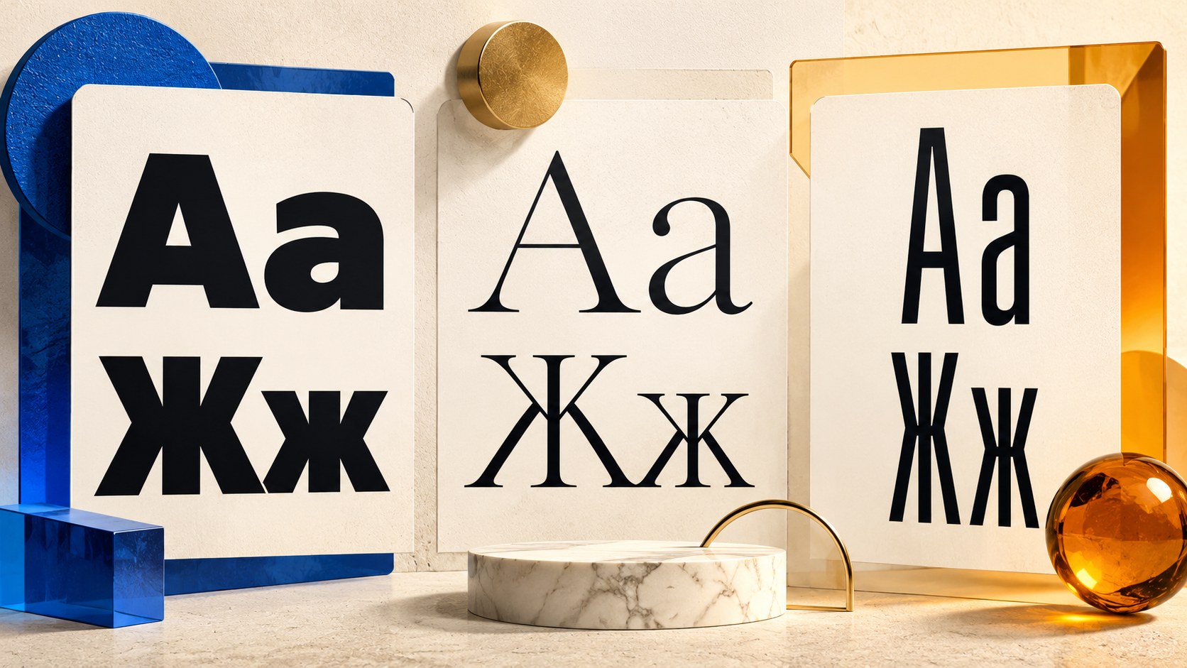
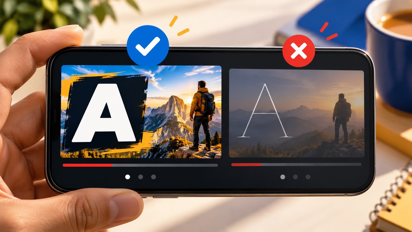
The best font for a thumbnail is the one that keeps your actual caption readable in the finished image. A fashionable typeface is not useful if its thin strokes disappear, the words become too wide or the file lacks characters required by your language.
Start with a clear, bold typeface, then check the caption at small size. Treat font selection, contrast and wording as one design problem.
What to look for in a thumbnail font
- Enough stroke weight to survive reduction without closing the spaces inside letters.
- Clear shapes that remain recognizable on a photograph.
- A width appropriate to the caption rather than an artificially squeezed layout.
- The letters, accents, punctuation, numerals and currency symbols you actually need.
- A license that permits the intended use.
Bold, ExtraBold and Black are useful starting weights, not automatic winners. A heavy decorative face can become less legible than a simpler bold one. Judge the final lettering against the actual background.
English and Cyrillic versions need separate checks
A font used in an English thumbnail may not contain Russian characters. An editor can silently substitute another font, leaving the Latin and Cyrillic parts visibly inconsistent. Missing accents and currency symbols can cause the same problem in other languages.
Test the exact downloaded file, not just the family name. Font versions and third-party adaptations can have different character coverage and licenses. A Cyrillic adaptation of a familiar Latin family is not necessarily supplied or licensed by the original creator.
For a Russian version, a useful character check is “Съешь же ещё этих мягких французских булок, да выпей чаю” in both cases, followed by digits and the required currency symbol. For English and other Latin-script languages, include the accents, apostrophes and symbols the real title requires. Watch for characters that change style or become empty boxes.
A practical shortlist to compare
These families offer different starting points. Use their official distribution and verify the specific font file and license before adopting one. The suggestions describe visual roles, not evidence of a CTR advantage.
| Family | Character | Useful starting role |
|---|---|---|
| Montserrat | Wide geometric sans serif | One or two short, bold words |
| Rubik | Friendly, slightly rounded | Lifestyle, hobbies and approachable explanations |
| Oswald | Narrow and tall | Longer labels, news or sports subjects |
| Roboto Condensed | Neutral condensed sans serif | Tutorials and product reviews |
| Fira Sans Extra Condensed | Very narrow | Long terms that still need readable height |
| PT Sans Narrow | Restrained narrow forms | Analysis and factual labels |
| Exo 2 | Technical feel | Games, devices and science topics |
| Russo One | Dense display lettering | Short automotive or technical accents |
| Unbounded | Broad, emphatic shapes | A single short focal word |
| Dela Gothic One | Heavy display style | Very short statements with ample room |
| Nunito | Soft rounded forms | Cooking, home and informal topics |
| Caveat | Handwritten character | A short secondary annotation |
Type the real caption in three or four candidates, reduce all versions equally and compare. A condensed family can preserve height in a narrow space, but it cannot rescue an overlong or confusing message. Avoid manually stretching or squeezing letter shapes.
For a consistent channel, start with one primary family and at most one contrasting style for a specific role. Variation in the scene can distinguish episodes without introducing a new typeface each time.
Outline, shadow or backing panel?
Text over a photograph crosses areas of different lightness. If it loses its edge, choose a separation method that remains clean at the displayed size.
- Outline: use a contrasting lightness around the letters. An outside stroke preserves more of the letter's interior than a heavy inside stroke. Check that counters in letters such as “a,” “e” and “o” remain open.
- Double outline: a second boundary can help on a very busy image, but adds complexity. Use it only when the simpler version fails.
- Shadow: a restrained, fairly defined shadow can separate text from the scene. Excessive blur may become a muddy halo when reduced.
- Backing panel: a solid or controlled translucent area can provide a stable background. Remember that the panel also takes space and can cover the main subject.
- No effect: on a plain, strongly contrasting background, clean text may already be enough.
Metallic, neon or dimensional effects are optional styling. Keep them only if the lettering remains readable.
Size, line breaks and placement
There is no universal point size because the source image and display layouts vary. If the caption fails when reduced, shorten it or change the composition before shrinking the type.
Try one or two meaningful lines. Avoid breaking a word across lines. Adjust line spacing so the blocks feel connected but do not collide. Slightly tighter capitals can work, but touching letters may merge after reduction.
Use capitalization deliberately. A short all-caps label gives a consistent top edge; a longer sentence may be easier to handle in normal case. Check both rather than treating capitals as mandatory.
Place the caption where the background is relatively calm. Avoid covering a face or the important product feature. Keep essential wording away from the lower-right area and bottom edge, where common interface overlays may appear.
Font licenses for monetized channels
Check the license attached to the actual font file. “Free download” describes the price of obtaining it, not necessarily permission to use it in a commercial project.
The SIL Open Font License permits using the covered font in commercial graphics without placing a credit on the artwork. Separate conditions apply when distributing or modifying the font software itself, including preserving notices and respecting reserved names. Do not reduce the license to a single rule about selling the font.
Adobe Fonts permits personal and commercial design use under its licensing terms. Its guidance also explains continued use of rasterized or outlined artwork after a subscription ends; continued editable use of the fonts is a different question. Check the terms relevant to your workflow.
A “personal use only” download may require another license for a monetized or sponsored project. Use the foundry or designer's official terms. When using fonts through an online editor, check that service's rules as well as any applicable asset terms.
Check generated lettering too
In Bloggers.tools, custom wording can be supplied in both generation modes. Inspect the finished image letter by letter, including punctuation and numbers. Then check readability at feed size. A polished-looking generated caption can still contain a wrong character or distort a name.
Frequently asked questions
What is the best YouTube thumbnail font?
There is no universal best. Compare a clear bold family such as Montserrat or Rubik with a condensed option such as Oswald or Roboto Condensed using your actual text.
Can I use an OFL font commercially?
Yes, for graphic design covered by that license. Verify that the file is genuinely distributed under OFL and distinguish creating an image from redistributing or modifying font software.
What if the font has no Cyrillic?
Choose a properly licensed version with the required coverage or use another family. Do not rely on silent fallback characters to create a consistent Russian caption.
Does every caption need an outline?
No. Use an outline, shadow or panel only when it improves separation. A simple high-contrast background may need none.
How do I spot missing characters?
Type the exact caption plus the relevant language's test characters. Look for inconsistent shapes, empty boxes and substituted symbols before exporting.
References: official Google Fonts repository, OFL usage guidance and Adobe Fonts licensing.