 Русский
 English
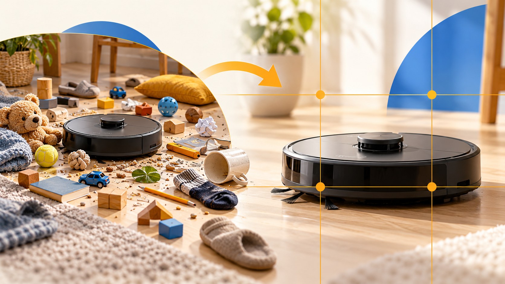
Thumbnail composition determines what a viewer notices first and whether the rest of the image helps explain it. A face, an object and a caption can tell one clear story. The same elements, given equal weight and scattered across the frame, can become visual noise. Start with a hierarchy, then decide the crop and layout.
Choose one main subject
The main subject might be a person, a product, a finished result or a distinctive place. Make it the easiest thing to identify. Supporting elements should explain why it matters; they should not compete for attention just because they are available.
- Primary: the object or person viewers must recognise first.
- Secondary: the problem, comparison or context that gives the subject meaning.
- Text: a short addition that says something the image cannot show clearly.
Consider a hypothetical video about buying a neglected cabin. A wide photo containing the building, owners, car, dog, tools and several arrows shows everything but explains little. A closer shot of the owner in the doorway, with the damaged room visible behind them, tells a more specific story. A price or a brief question can complete it if that detail is important to the video.
Before adding anything, remove it temporarily. If the promise is still clear, the element may not need to return. This is a practical editing method, not a strict limit of three objects.
Choose the shot size by what must remain visible
A desktop editing canvas can make a small face look adequate. In a recommendation card, the same face may lose its expression completely. Decide which information needs to survive at the final display size.
| Shot | What it shows | When to use it |
|---|---|---|
| Close-up | Face and shoulders | The expression or familiar person carries the idea |
| Medium shot | Upper body, gesture and a held object | The action or relationship to the object matters |
| Wide shot | Person and surroundings | The location or difference in scale is the story |
| Detail | A product or part of it | A fault, feature, ingredient or result needs close inspection |
For a reaction thumbnail, shrink the image and ask what emotion you can actually recognise. If the expression becomes ambiguous, crop closer or choose a stronger source photograph. A frame composed for a talking-head video may include useful surroundings that are unnecessary in its thumbnail.
Portrait conventions can help: avoid accidental cuts through wrists, elbows or the neck; leave space in the direction of movement; and do not treat a slightly cropped crown as a fatal error in a close-up. These are composition choices, not YouTube requirements.
Four layouts worth trying
Choose the layout after identifying the story. A familiar design grid should make the idea clearer, not force every video into the same pose.
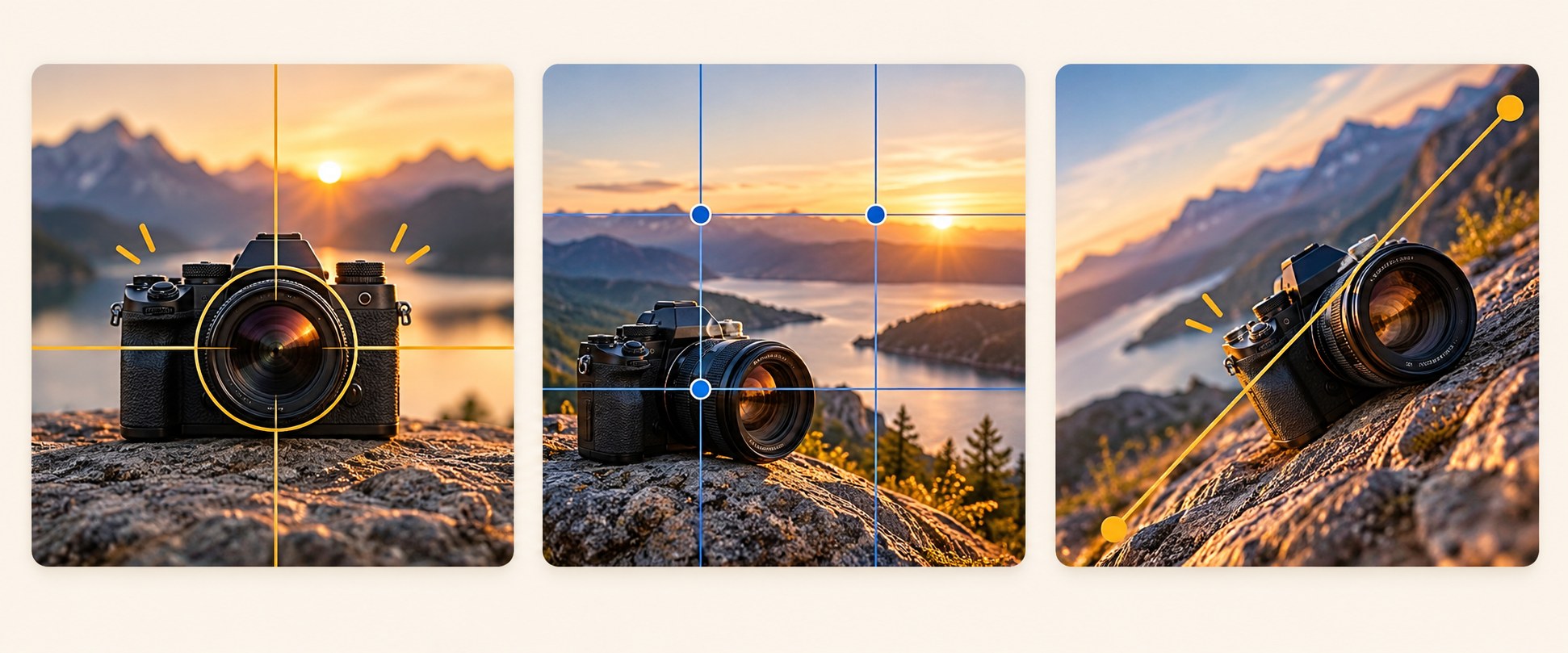
Rule of thirds
Divide the frame into three columns and three rows. Placing the subject near a vertical division leaves space on the other side for an object or caption. Eyes near the upper horizontal division often give a face room to feel prominent without filling the whole image. YouTube mentions this approach in its thumbnail guidance, but it is an option rather than a requirement.
Centred subject
A central composition works well for one product, a symmetrical setting or a direct-to-camera statement. Keep the surrounding space purposeful. A centred face can still work with text above it, provided the caption does not obscure the expression.
Split comparison
Use two sides for before and after, two competing products or expectation versus reality. Each side must remain intelligible on its own. A scratched panel next to the repaired panel is clear; two nearly identical full-room photographs may hide the difference. Keep scale and angle comparable when they affect the meaning.
Diagonal movement
A road, an extended arm, a tool or an athlete's body can create a diagonal that leads towards the important detail. This can suit active subjects, but a diagonal is not automatically more engaging. Use it when the action already belongs to the story.
Reserve space for the caption before making the image
Trying to fit text after the composition is finished often leads to words covering the subject. Plan a quiet region such as a wall, sky or simplified background. Keep the letters away from essential faces, product details and the edges of the frame.
- Allow room around the caption rather than stretching it from edge to edge.
- Keep critical information away from interface overlays, including the duration label commonly shown at the lower right of standard video cards.
- Choose a background with consistent contrast across the whole word.
- Test the final caption in the intended language; translations often need a different line break.
There is no universal rule that text belongs on the left. The right position depends on the subject, background and visual direction.
Use gaze, gestures and lines deliberately
A subject looking towards the camera can create a direct relationship with the viewer. A subject looking at a damaged object suggests that the object deserves attention. A person looking out of the frame can work if the missing subject is the question, but may otherwise direct attention away from the useful content.
Hands and scene geometry can perform the same job. A finger points to a result; a cable leads to a failed connection; the edge of a bench leads towards a tool. Add an arrow only when it explains something the natural composition cannot. Several arrows can become competing focal points.
Separate the subject from the background
A well-positioned subject can still disappear if its outline has the same brightness as the background. Simplify the scene, soften distracting detail or introduce a light-dark difference. Edge lighting and a restrained outline can help, but thick decoration cannot rescue an unclear idea.
Build a vertical composition separately
A 16:9 layout and a 9:16 layout allocate space differently. A face and object placed side by side may need to be stacked in the vertical version. Cropping can remove the very detail that explains the video. Start with the same promise, then rebuild the arrangement for the narrow frame.
For Shorts, also inspect the actual card and player surfaces where the image will appear: interface elements and crops can vary.
A five-step composition check
- Reduce the image to the size of a mobile card and a desktop recommendation.
- Blur it slightly or squint. Does the intended subject still dominate?
- Temporarily mirror the design to spot imbalance, then restore it. Do not publish reversed lettering or misleading product details.
- Place it beside representative thumbnails from the same topic.
- Ask someone unfamiliar with the video to describe what they expect to watch.
A viewer who identifies the wrong object has given you a useful diagnosis. Make the relevant element larger or more distinct before adding explanatory text.
Specify the layout when generating a thumbnail
In Bloggers.tools, Automatic mode develops an idea, composition and text from the video's subtitles. Professional mode offers three concepts before you choose one to generate. You can clarify the chosen direction: “Close-up of the creator on the right, looking towards the broken part on the left; leave the upper-left background clear for a short caption.”
Review the finished image for the same hierarchy as a manually designed thumbnail. A vertical version is a separate generation, so inspect its placement independently. Three concepts are planning options, not three automatically delivered test images.
Frequently asked questions
Can the person stand in the centre?
Yes. A central subject works when it carries the idea and there is enough room for any essential supporting detail. Move it off-centre when the other elements need space, not merely to follow a grid.
How much of the image should a face occupy?
There is no universal percentage. The expression must remain readable at card size while leaving room for the story. If the face dominates but the reason for the reaction disappears, you have gone too far.
How should I arrange two people?
First check that both are necessary. For an actual exchange between two people, separate close crops can work better than a distant shot of the whole studio. Make the relationship between them clear and avoid inventing a confrontation.
Is a centred product boring?
Not if the product or its visible detail gives the viewer a reason to watch. A clear crack, unusual feature or genuine comparison can carry more information than a complex background.