 Русский
 English
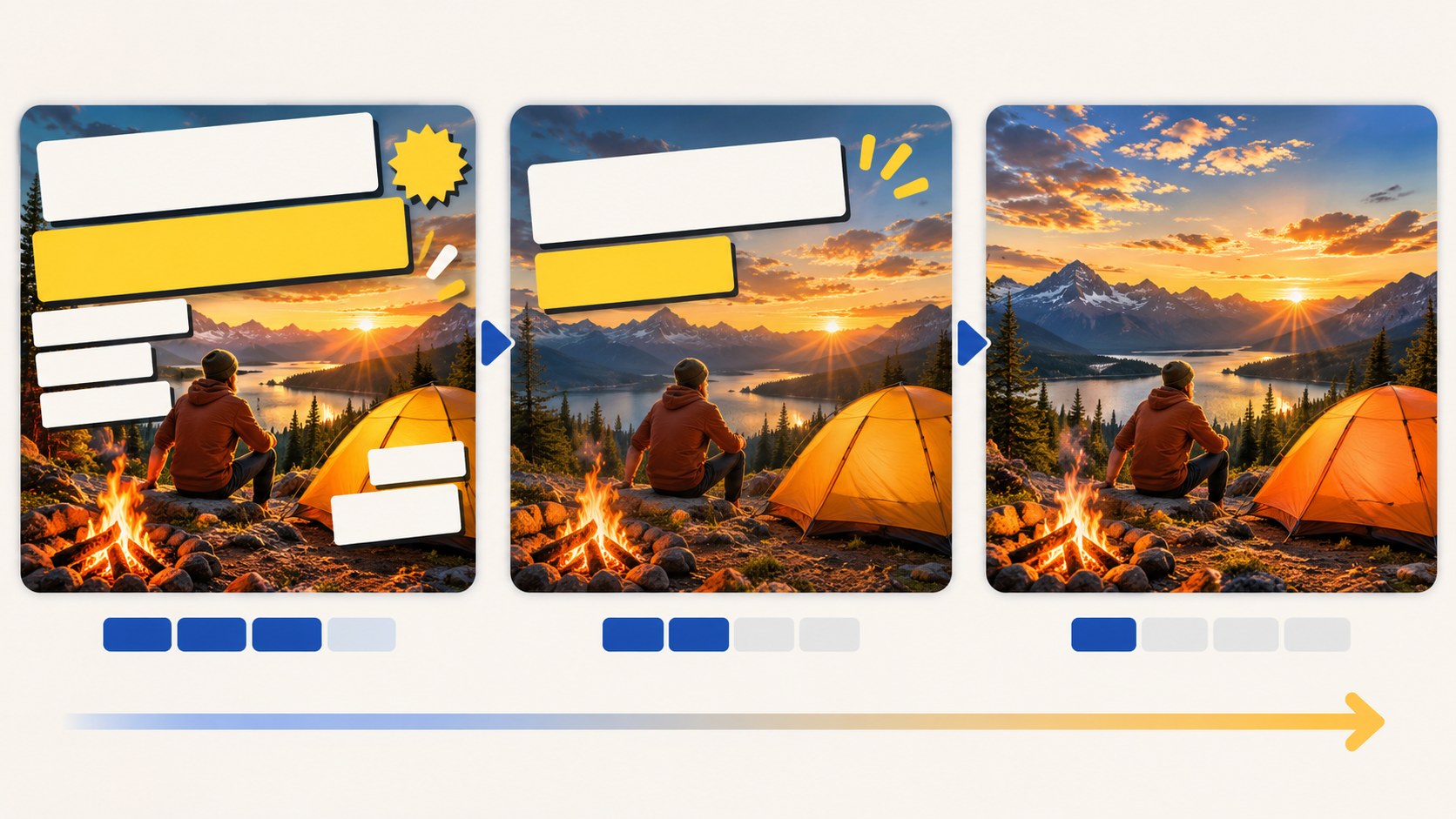
Use enough text to add a useful detail, and no more than remains readable when the image is small. One to three short words or a number is a useful starting point for many designs. Sometimes no text is better. These are editorial guidelines, not YouTube word limits or a formula for higher CTR.
Measure the space the actual lettering occupies. “RESTORATION” and “FIXED” are both one word, but they make very different demands on the layout.
Choose text according to its job
| Situation | Possible approach | Fictional example |
|---|---|---|
| The image clearly shows the result | No caption | A finished dish or restored room |
| A single fact changes the offer | A number and short unit | “30 DAYS” |
| The video contains a meaningful conflict | A brief question or verdict | “WRONG MOVE?” |
| An interview has a strong actual line | A short, accurate quotation | “START SMALL” |
| Two products are compared | Short labels | “BUDGET vs PRO” |
| A tutorial has a useful constraint | Task or condition | “NO MIXER” |
Choose wording the video supports. A dramatic quote or result in this table is a writing example, not a statement to attach to an unrelated upload.
Why text runs out of room
A thumbnail designed on a large monitor may later appear beside a player, in a phone feed or on a television viewed across the room. Small letters and fine details are the first things to become difficult to read.
The image also needs room for its main object or person. If six words take over most of the composition, the viewer may no longer identify the subject that gives those words meaning. Adding a second line is sometimes useful, but it does not create unlimited space.
The title is available for additional context. Divide the information instead of trying to fit the whole explanation into the image.
Shorten the idea, not just the spelling
When a caption is too long, first ask what the picture already tells the viewer. If the image clearly shows a loaf of bread, the caption may only need the unusual condition. If the title already names the phone, the image can focus on the long-term verdict.
| Long draft | Shorter option | What carries the missing context |
|---|---|---|
| How I prepared for the exam in one month | “30-DAY PLAN” | The title identifies the exam |
| The most common mistakes people make at the gym | “STOP THIS” | A clear image shows the specific mistake |
| A complete review after using this phone for a month | “ONE MONTH LATER” | The product is visible and named in the title |
| Homemade bread without using a mixer | “NO MIXER” | The finished bread supplies the subject |
| What changed after thirty days of practice | “DAY 30” | The image and title establish the activity |
| Is the premium version worth paying extra for? | “WORTH THE EXTRA?” | The two alternatives are recognizable |
A short phrase is not automatically clearer. “STOP THIS” becomes empty clickbait if the picture does not show what “this” means. Keep enough concrete information for an unfamiliar viewer to identify the subject.
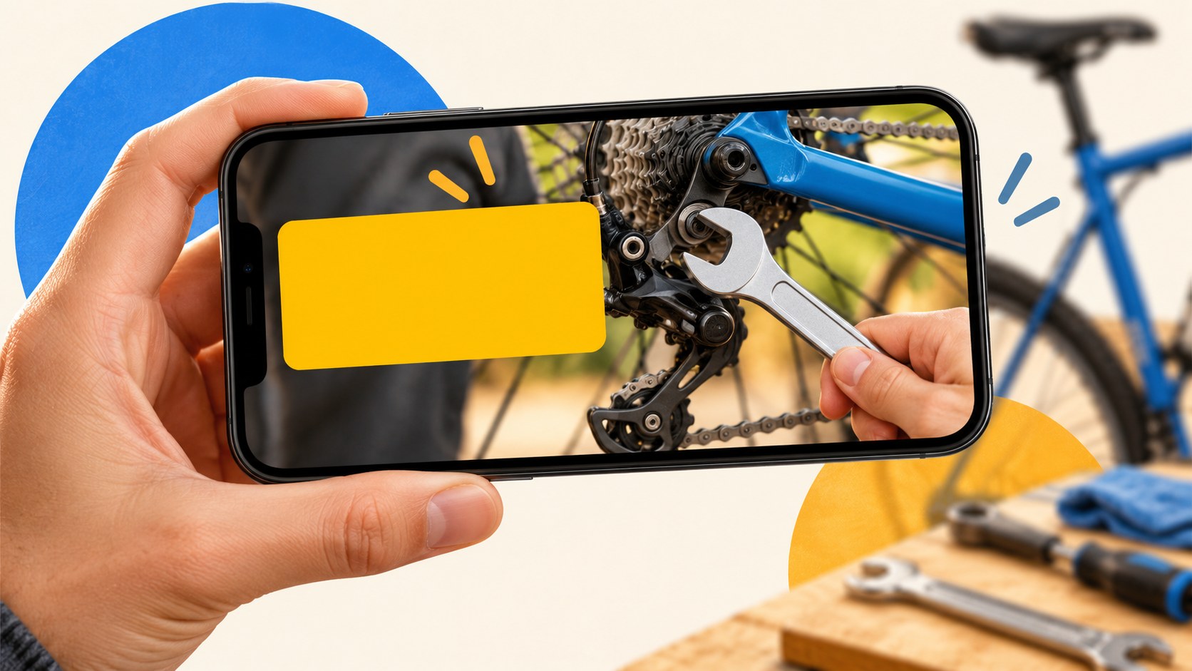
Practical ways to reduce width
- Replace a long term with a shorter accurate phrase when the audience will understand it.
- Use numerals for relevant quantities instead of spelling them out.
- Remove introductory wording and repeated subject names.
- Move supporting context into the title.
- Try a genuine condensed font before making all the lettering smaller.
- Use two meaningful lines rather than breaking a word in the middle.
- Avoid abbreviations that require decoding.
Do not remove a qualification that changes the claim. “FREE” is not an honest replacement for “free during the trial,” and a currency amount needs the relevant context. Clarity includes accuracy.
Localize the layout as well as the words
For English-language thumbnails, shorter wording is often available, but English is not automatically compact: technical terms and product names can still be long. A Russian adaptation may require a different line break or condensed typeface because the translated phrase occupies different space.
Keep the meaning aligned across languages rather than forcing identical word counts. Check each version with its actual characters, punctuation and font. A text-free image can reduce language dependence, although symbols and visual references are not understood identically everywhere.
When to remove text entirely
Try a clean version when the scene already presents a clear transformation, place, object or reaction and the title supplies the necessary explanation. Ask what information disappears when the lettering is removed. If nothing important is lost, the image may benefit from the additional space.
Do not remove text merely because a large channel uses text-free thumbnails. A simple image still needs a useful relationship with the title and the intended audience.
When a longer caption is justified
An interview quotation, a comparison or a specialist term may genuinely need more words. Establish a hierarchy: one main word or phrase should be readable first, while the rest supports it. Simplify the background and avoid making every word a different color.
Shorten quotations without altering the speaker's position. Keep required qualifiers. If the complete wording cannot survive at small size, use a different accurate quote or put it in the title instead.
Three questions for every word
- Is this already communicated by the title?
- Is it obvious from the image?
- Will the intended viewer understand it without extra explanation?
After editing, test the design in a small mock feed and at a normal viewing distance.
Set your own thumbnail wording
Bloggers.tools lets you supply custom text in Automatic and Professional modes. Review suggested wording for length, spelling and consistency with the video. Video SEO can help draft a complementary title; choose both as one package.
Frequently asked questions
Is there a maximum word count?
There is no universal editorial limit that suits every thumbnail. A few short words are a useful starting constraint; the actual test is readability and meaning at the displayed size.
Should I use all caps?
Try capitals for a short label and normal capitalization for a longer phrase. Font width, spacing and the specific words matter more than a blanket rule.
What if the key term is long?
Use a clear shorter alternative, try a condensed face or move the term into the title. Do not squeeze the letters horizontally until their shapes become distorted.
Can icons replace words?
Sometimes. An arrow, check mark or percentage symbol can be compact, but it must remain recognizable and mean what you intend. Check it after reduction.
How many lines should I use?
One or two is a practical starting point. If a third line is necessary, make sure the main idea works without reading every detail. Reconsider whether the caption is trying to summarize the entire video.
Platform reference: YouTube A/B test documentation.